The NZ data is crystal clear evidence that the COVID vaccine is deadly. A simple, stunning example by Steve Kirsch – SubStack
Executive summary
The deaths since dose curve goes up in every country and and after every dose that we have data on. Here’s an example from New Zealand.
Introduction
Below is deaths per month since getting Shot #1 in the months of July, Aug, Sept 2021. The x-axis is the months since shot #1 was given. All ages are included so nobody accuses me of “cherry picking.” The deaths are counted relative to the day that the person got the shot.
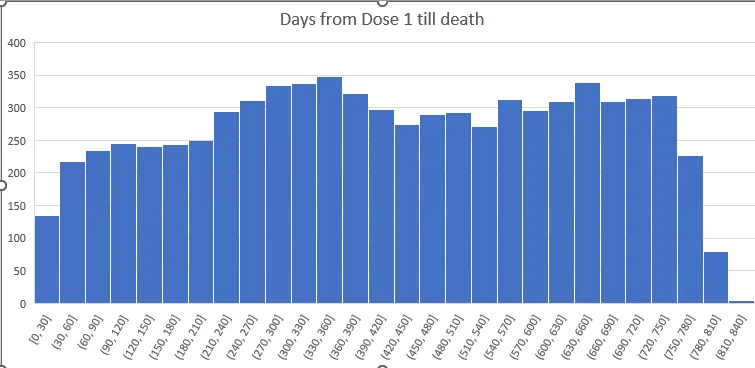
The reason this is so stunning is the deaths keep going UP every month for the first year.
This is counter to two strong forces causing it to go DOWN for the first 6 months:
- In a “safe vaccine” (if there was such a thing), the deaths per day always falls monotonically, typically a few percent or more if the cohort is older. There can be a short period of this being violated if something big is happening in the background and the shot was given over a short time period. For practical administration of a vaccine, the curves always slope down after a few weeks from day 0 (known as the temporal healthy vaccinee effect). The cause of this is it is a fixed size cohort and deaths are always proportional to the number of people available to die. This is why “relatively” safe vaccines (there are no safe vaccines) have deaths per day that always slope down. See this article for a more in-depth discussion of this “gravity” effect.
- August is a peak death month in New Zealand (the equivalent of our “winter” in the northern hemisphere). So I chose the peak month of death for when the vaccine is given and two months around that just to get more data points so there is less noise. So there is a heavy bias for deaths to drop over 6 months due to background seasonality (a 27% drop) effects (death rates going down dramatically.
Here’s the graph from data from StatsNZ and you can download it yourself here.
This is from August 2015 by month. The deaths peak every August and the peak to trough varies by 27% in 2021 (=3342/2628).